The Pharmacy and The Gallery are so inextricably linked by their connection to colour that it seems very fitting that an old pharmacy should evolve into a contemporary art space. Early on in the initial clearing out of old boxes in the cellar we found a number of pestles and mortars but to add to our hoard of apothecary objects we recently discovered these fabulous two pieces buried amongst the dirt in the boarded up and long abandoned coal chute.
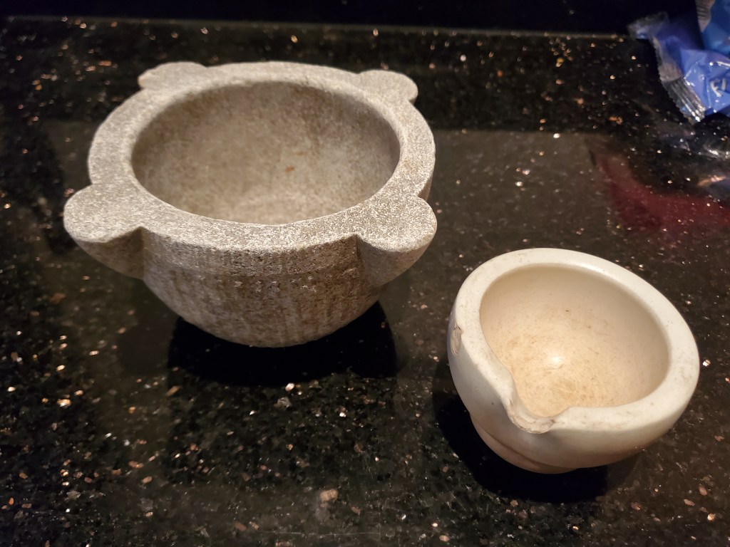
Alongside the obvious vision of pharmacists crushing medicines and potions in their quest to cure a wide range of maladies and ailments, images of Victorian colour-men come to mind, pulverising rare rocks and minerals into colourful powder to provide artists with the perfect pigments for painting. Science, health and art in action. An inspiring formula for the creative workshops planned for the upstairs space in the coming years.
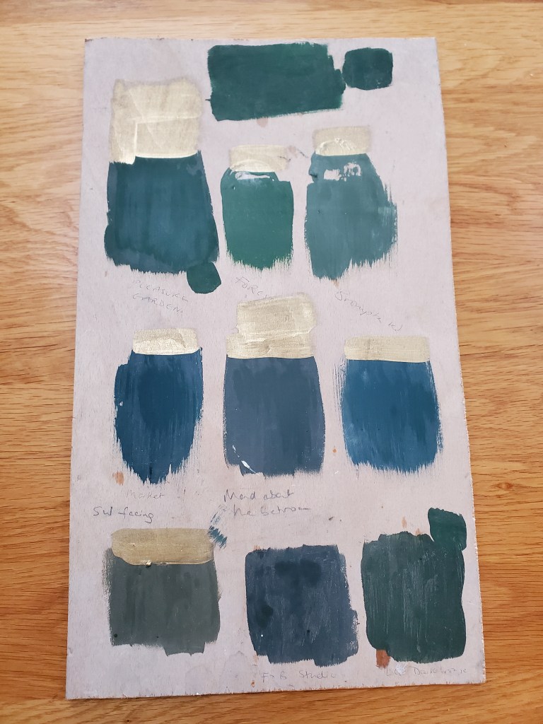
The complete palette for the different areas in the Gallery is still yet to be decided. An easy decision to choose a dark green for the shop front in keeping with the colour we understand it may have originally been, made difficult by the seemingly endless choice of ‘green’ now available. Sometimes wonder if there’s too much choice these days.
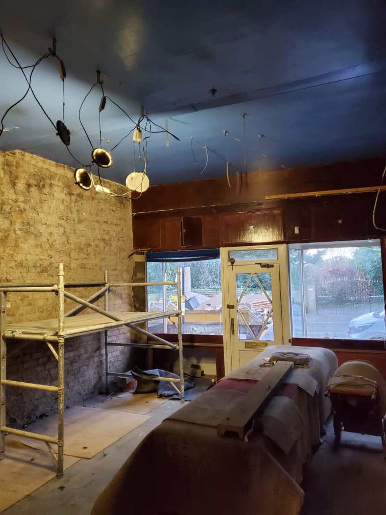
Boldly selected ‘Wine Dark’ by Farrow and Ball early on as the main colour for the gallery space to compliment the mahogany shelving and bronze lighting. for anyone not familiar with this colour, it has nothing to do with wine and it is more towards the colour of ‘perfect blue’. By some strange coincidence, when the previously lowered ceiling was taken down it revealed a shade of blue on the original ceiling not dissimilar to the one we have actually chosen. The building seemingly pushing a return to its roots.
It all feels a little bit mystical. Re-kindling the alchemy in this enchanting building.
